The Red Thread Café is a design study based in Vancouver, B.C. The name is inspired by the ancient Chinese legend of the red thread of fate—a symbol of the invisible connections that bring people together. The design embodies the elegance of Chinese culture while integrating contemporary elements to appeal to a diverse clientele.
This project aimed to celebrate the harmony between tradition and modernity. Drawing from the Legend of the Red Thread of Fate, the café's graphic design creates a compelling visual narrative representing the meaningful connections formed within this space.
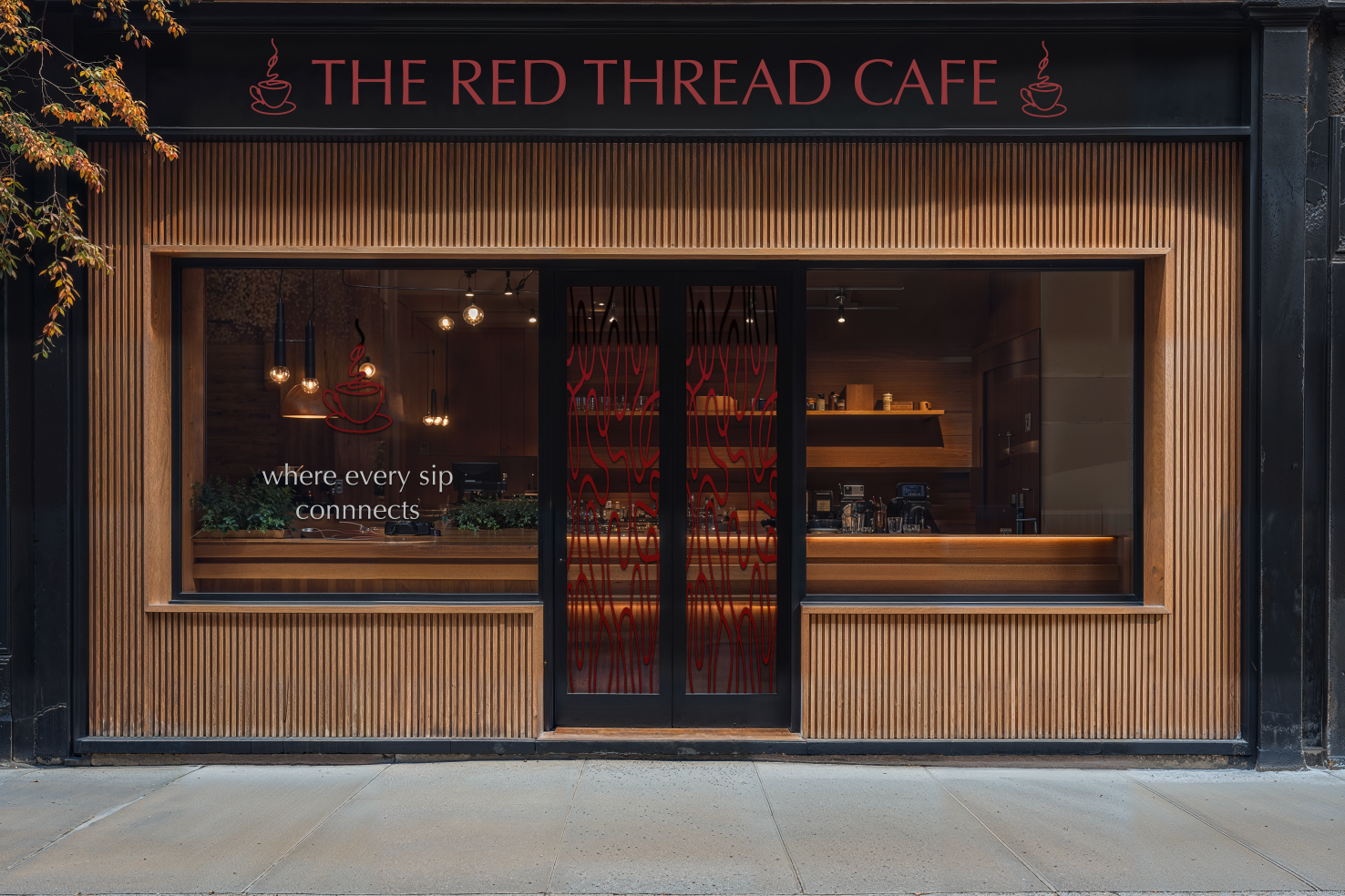
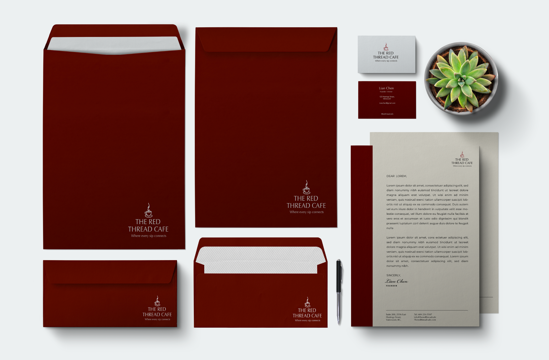
For the café's colour palette, deep red and charcoal symbolize heritage and modern sophistication. Earthy tones evoke the richness of coffee, grounding the design, while soft cream accents add warmth and approachability.
The logo features a minimalist coffee cup seamlessly integrated with a continuous, flowing line—representing the red thread of fate. This simple yet powerful design visually embodies the idea of destiny weaving people together, much like the café itself.
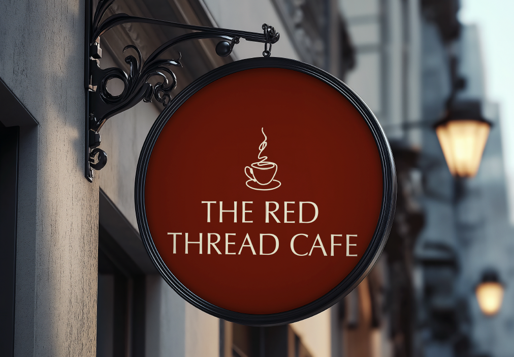
Typography plays a crucial role in reinforcing the brand's identity. The primary typeface was carefully selected to exude elegance, tradition, and authenticity, reflecting the café's fusion of cultural heritage with modern aesthetics.
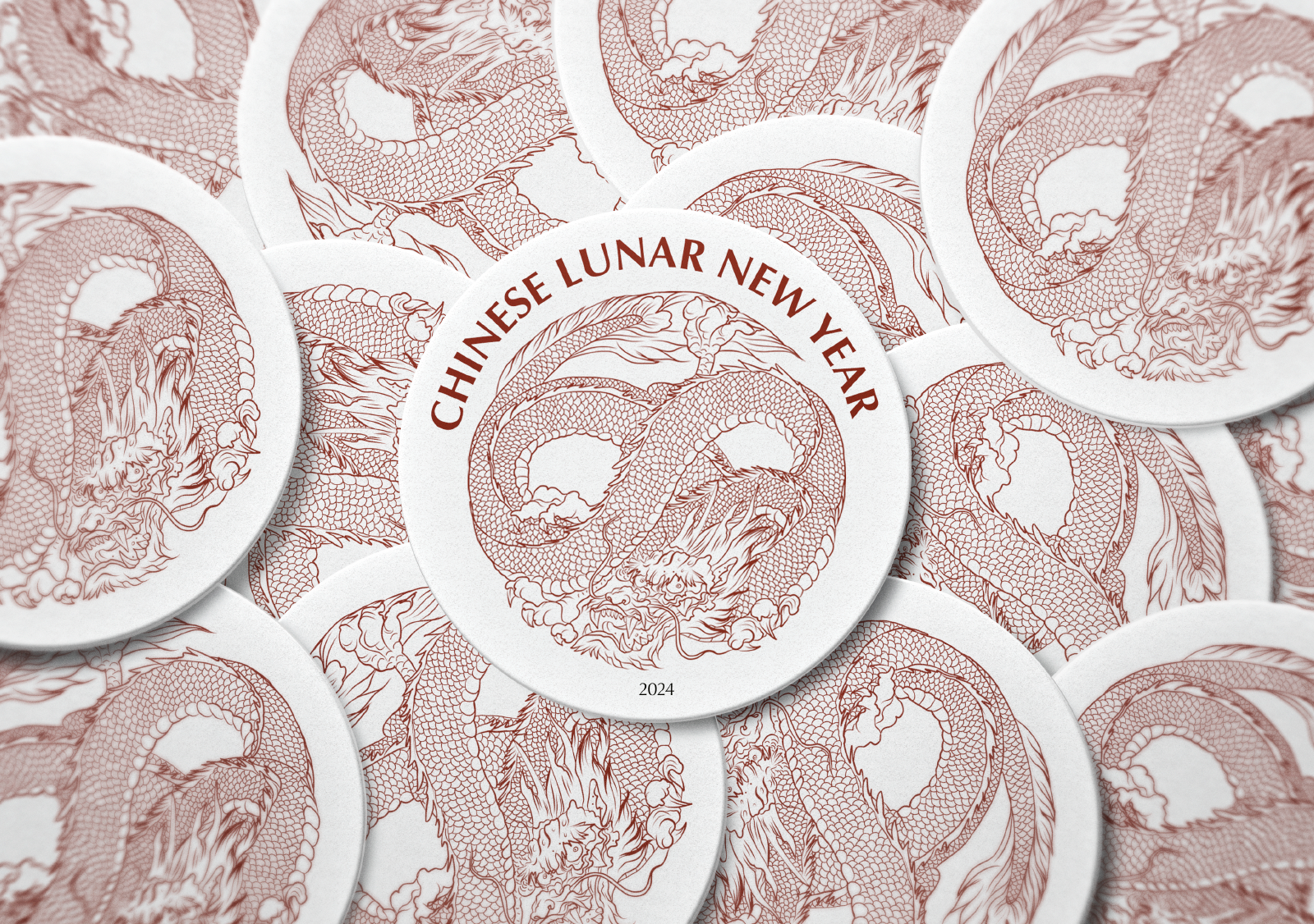
Throughout this project, the emphasis was on crafting a cohesive brand identity that extends seamlessly across all customer touch points. Every design element, from business cards and posters to packaging and storefront signage, was thoughtfully integrated to ensure a unified and immersive brand experience.
Navigating through an oversaturated market presented a significant challenge for this project. However, it also served as an opportunity to carve out a distinctive niche and differentiate the brand through innovative strategies and unique offerings.
Through The Red Thread Café, I discovered that nurturing community and well-being can be both inviting and inspiring—proving that wellness-focused spaces don’t have to be sterile or dull. By weaving in rich cultural symbolism, warm earthy tones, and thoughtful storytelling, the brand becomes a joyful invitation to slow down, connect, and savour everyday moments.
Illustrator | Photoshop | Branding | Logo design