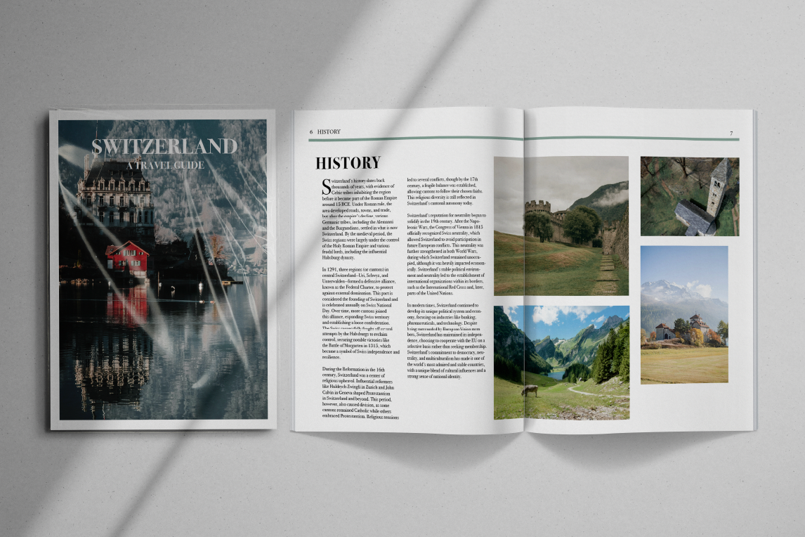
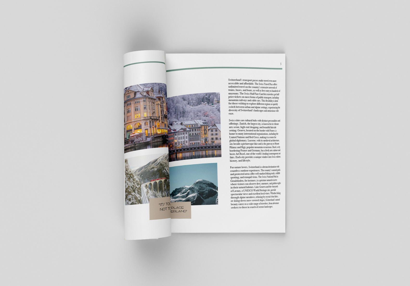
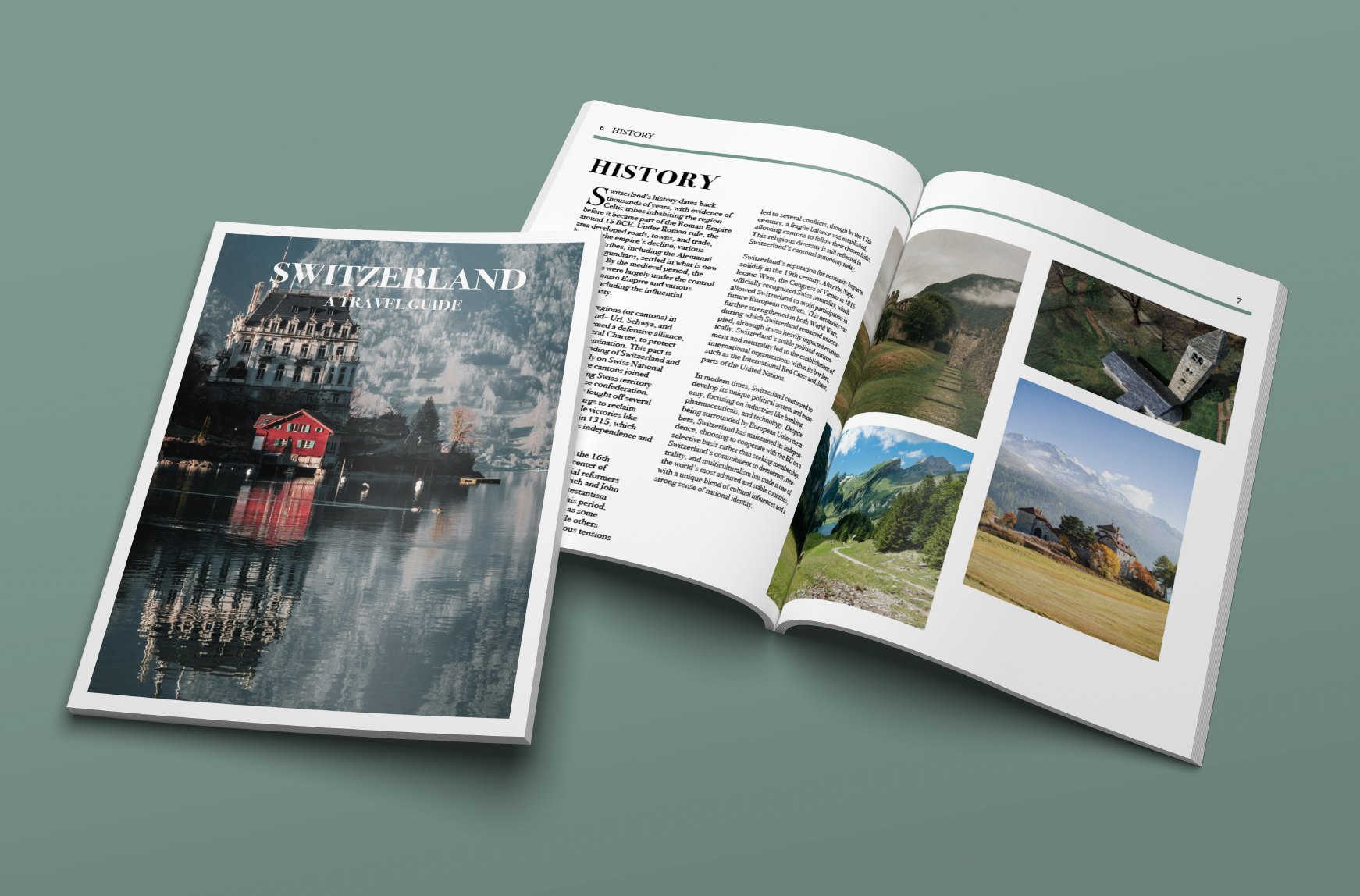
This is a fictional travel magazine devoted to uncovering the rich tapestry of Switzerland through its historical landmarks, architectural marvels, and deep-rooted cultural traditions. Each spread delves into a different Swiss region or city, offering readers a window into the country’s storied past and refined present. The magazine is crafted for culturally curious travelers who appreciate nuanced storytelling, elegant design, and immersive experiences.
In this project, I conceptualized the editorial theme for each issue, authored compelling columns, and designed both the cover and internal page spreads. My creative direction focused on evoking the timeless charm and elegance of Swiss locales while celebrating the country’s layered cultural identity. To achieve this, I employed a refined blend of collage and montage techniques, weaving together archival imagery, modern photography, and elegant graphic elements to reflect the harmonious intersection of heritage and innovation.
Considering the flexibility and accessibility, this magazine can also be present in the digital world, such as tablet, mobile, and PC. The digital version is designed for readers who prefer digital media, allowing them to delve into immersive travel stories with just a few swipes on their devices
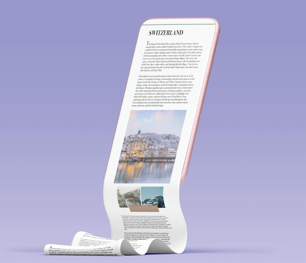
Tablet
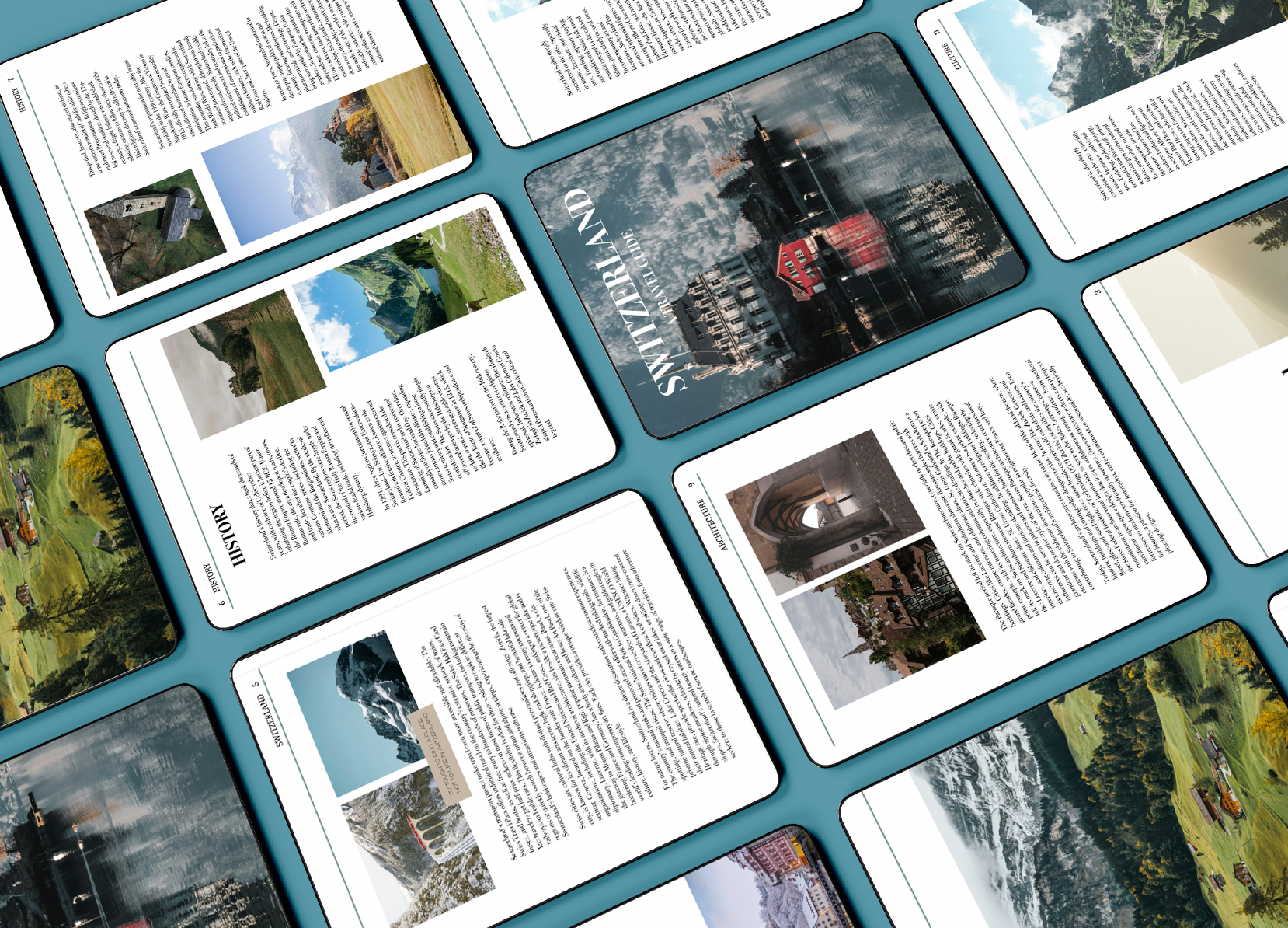
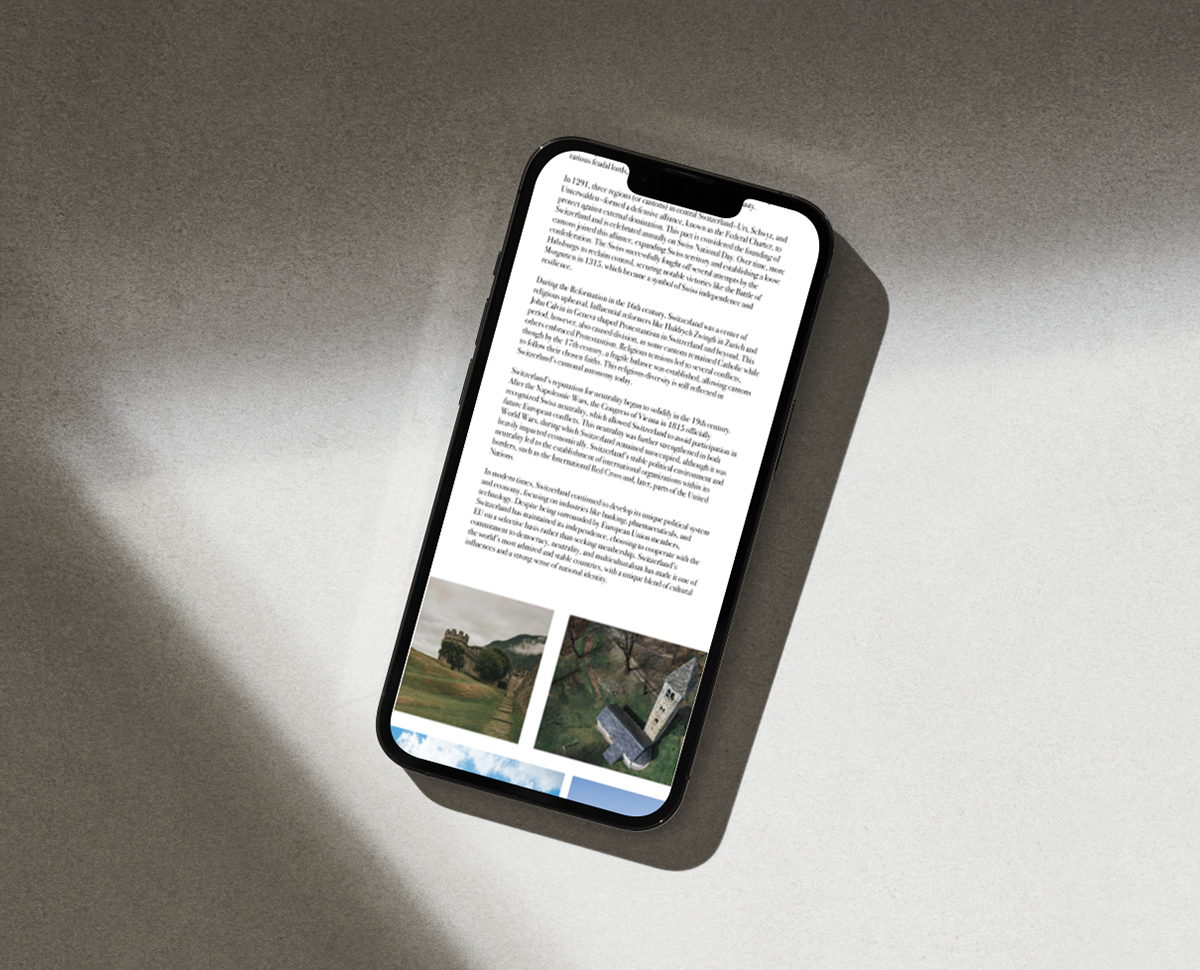
phone
This project deepened my appreciation for Swiss culture and refined my ability to tell visual stories with historical and architectural depth. Designing this magazine strengthened my passion for editorial layout and thoughtful design systems, giving me a strong foundation for future work that bridges cultural heritage with modern storytelling.
The main difficulty with this project was finding a way to adjust the responsive design per device while still maintaining the concept and the design to show through. Specifically, I found that starting out on a bigger screen and sizing down was much harder since there was more information and elements needed to fit on a much smaller screen.
Overall, I learned the importance of establishing a grid early on and the impact of font pairings that can affect your concept and overall brand identity. I found that this was necessary to maintain because I needed to demonstrate the clean and modern look of the Luxe Magazine brand throughout the magazine.
Indesign | Editorial | Figma