Goodreads, a leading platform recognized for its vibrant community of readers and comprehensive book catalog, has embarked on a journey to redefine its digital presence with a redesigned mobile application. This case study delves into the evolution of the Goodreads app, presenting a cleaner and more user-centric version that aligns seamlessly with the platform’s mission to help users discover, review, and discuss books with ease.
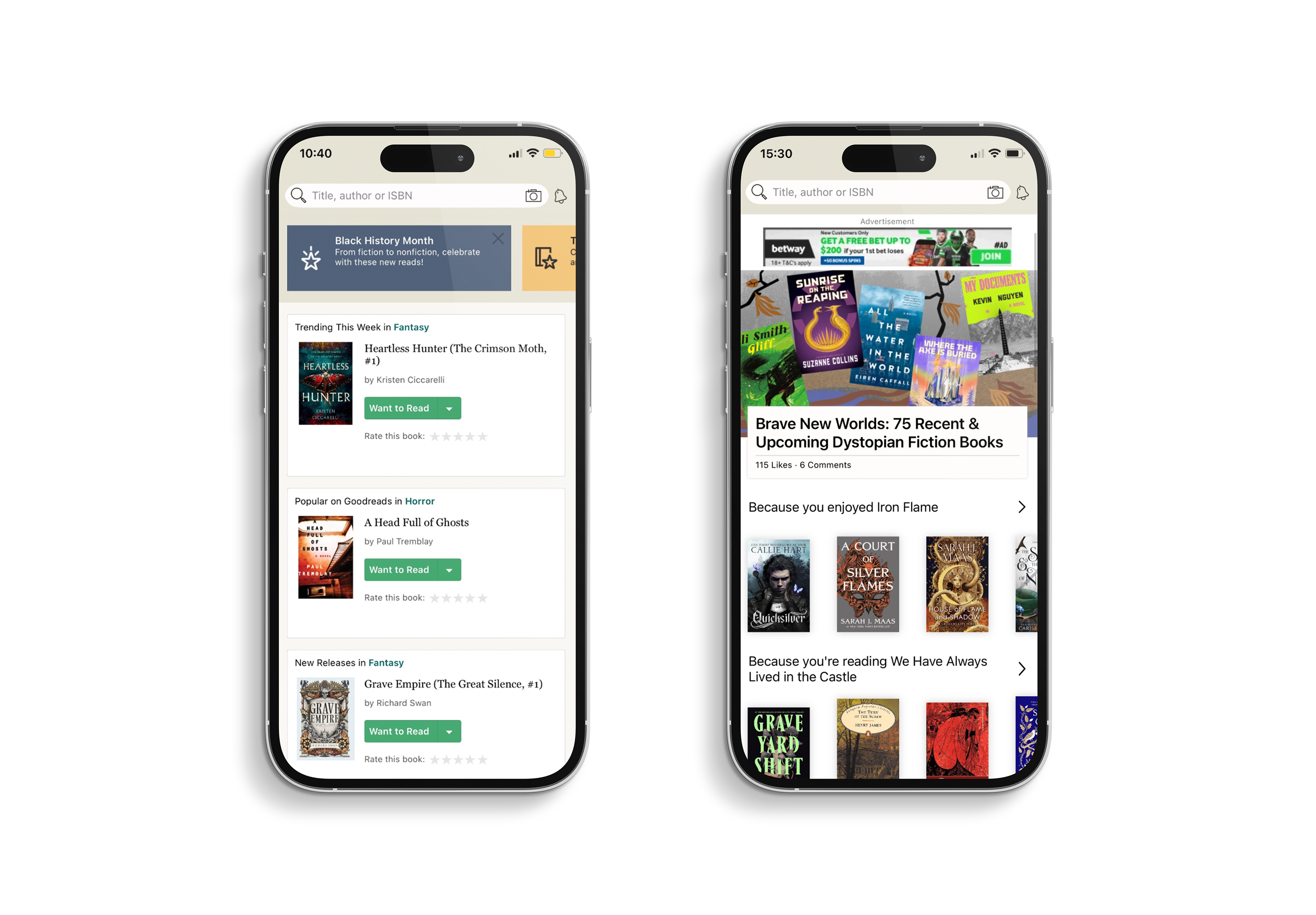
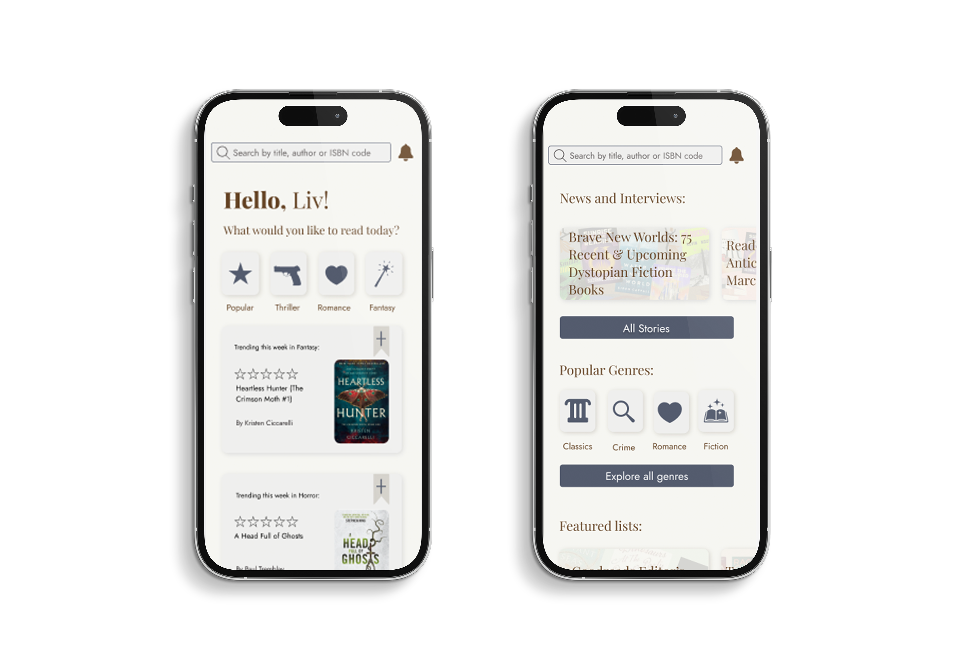
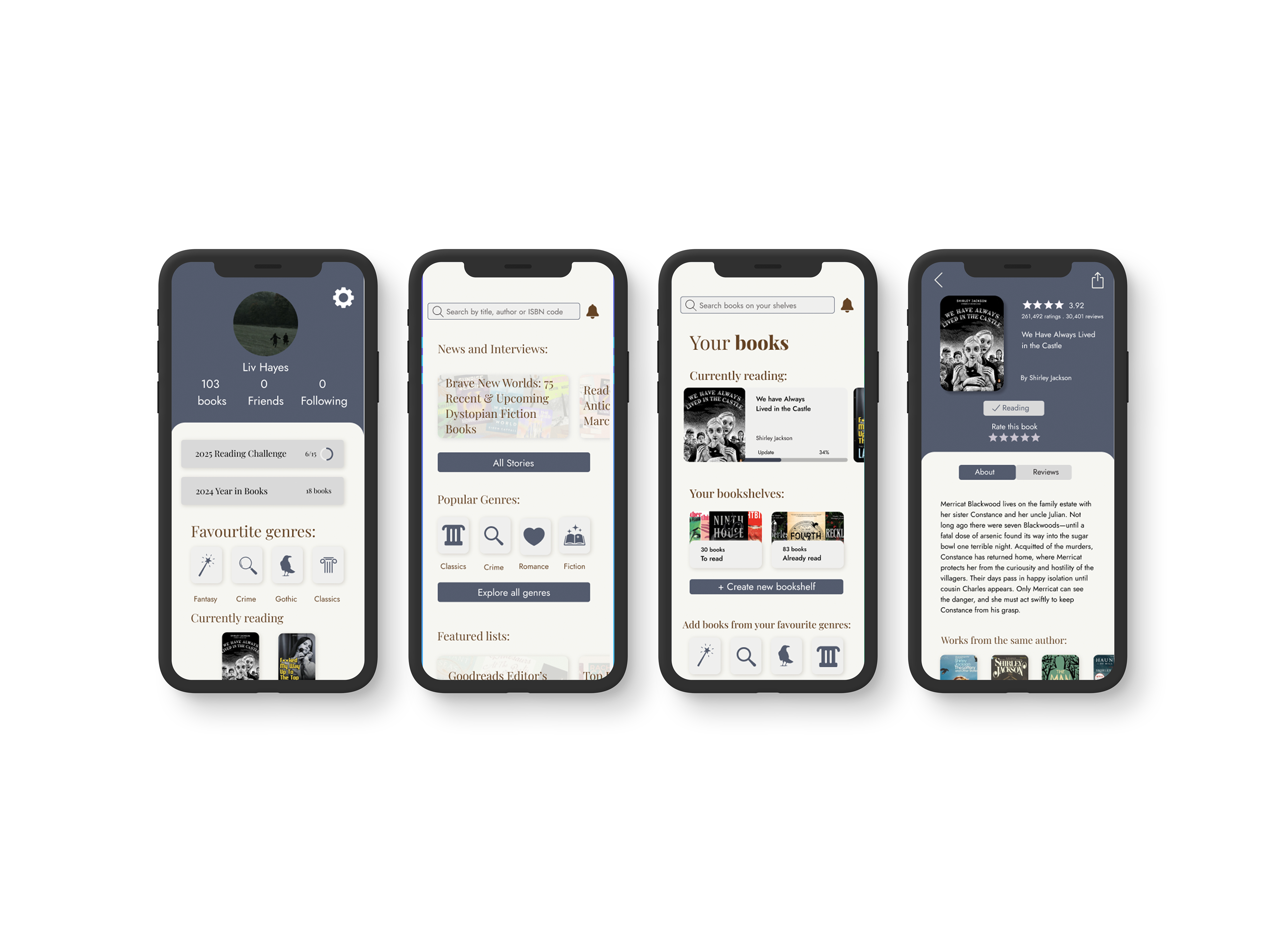
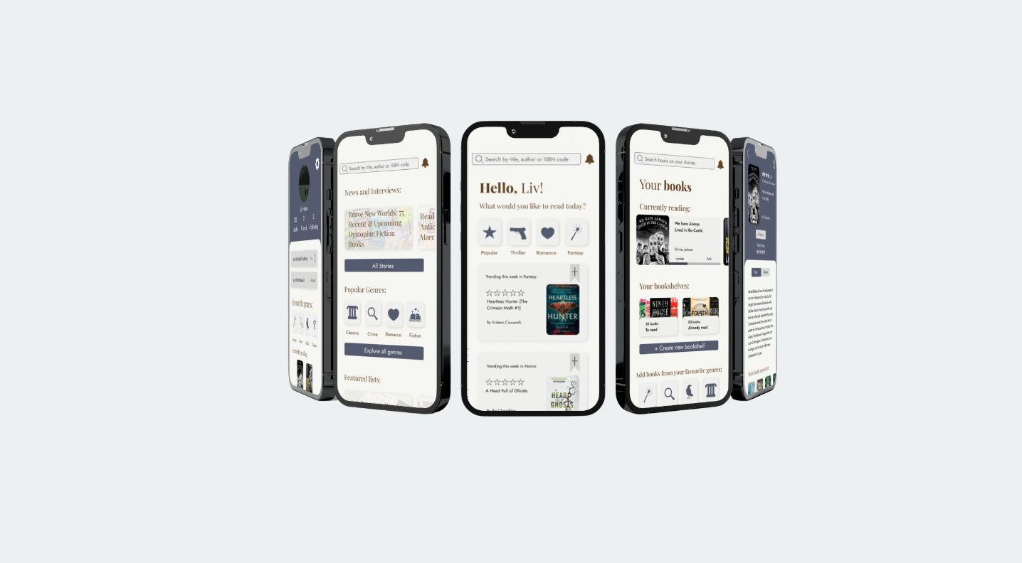
In revamping the Goodreads app's homepage, the primary focus was on simplicity and user-friendliness. with clean imagery and intuitive typography, distractions were minimized—allowing users to focus on discovering and engaging with books effortlessly. The decision to retain Goodreads’ well-known features ensures consistency for long-time users, while also making the platform more accessible for newcomers.
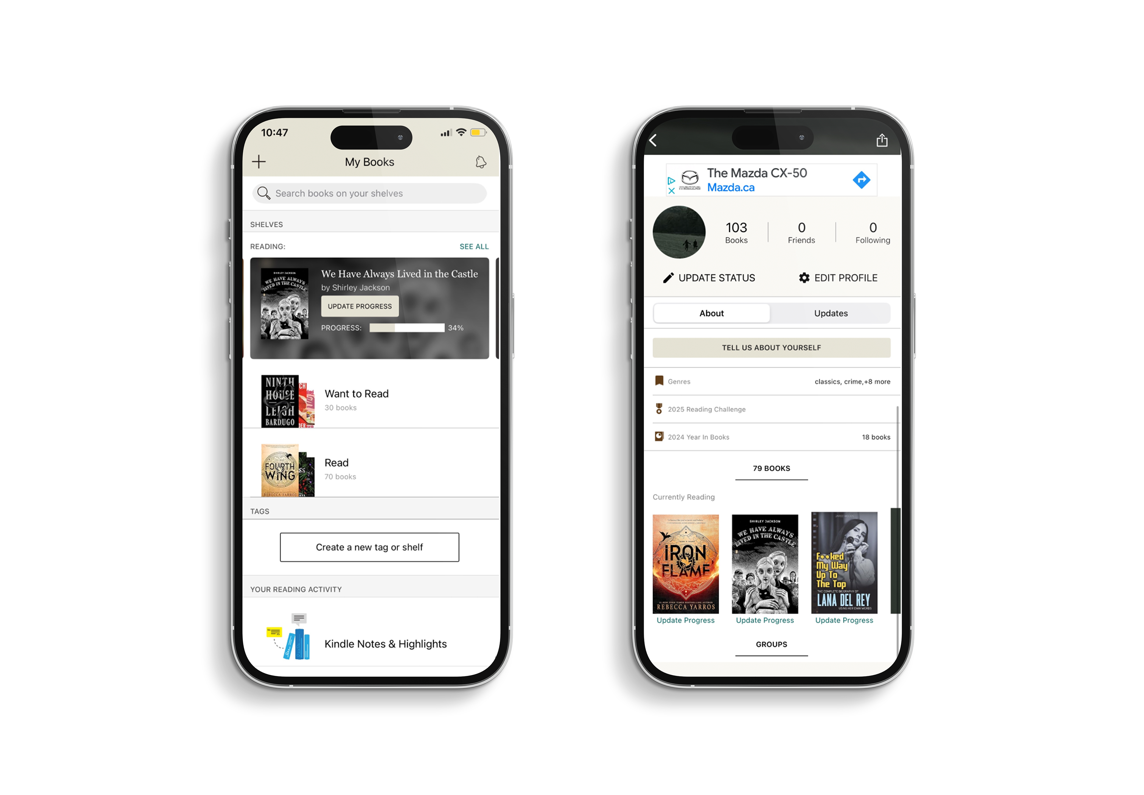
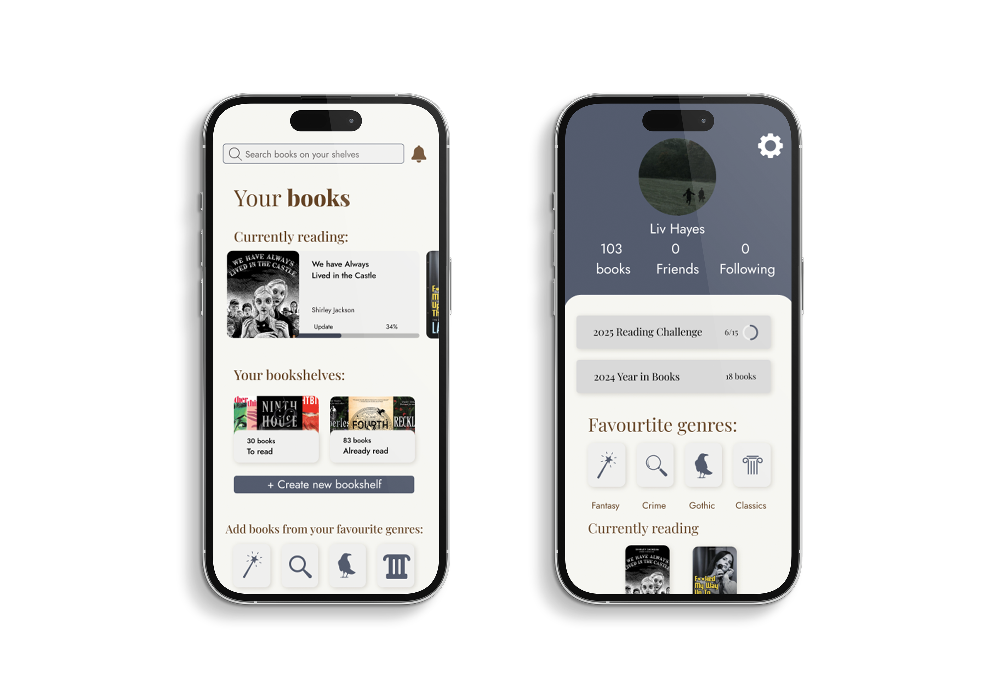
In refining the book your books page of the Goodreads app, a priority was placed on facilitating an effortless exploration experience for users. This intuitive feature streamlines the browsing process, empowering users to swiftly discover books that align with their interests and reading goals, ultimately enhancing satisfaction and encouraging deeper engagement.
By offering a clear overview of these details at a glance, readers can easily assess which titles resonate most with the community. Additionally, a more prominent placement of the “shelved books” section offers users a convenient way to bookmark books of interest, supporting a personalized and organized reading journey. The ultimate goal was to simplify the discovery process and reducing friction in their experience.
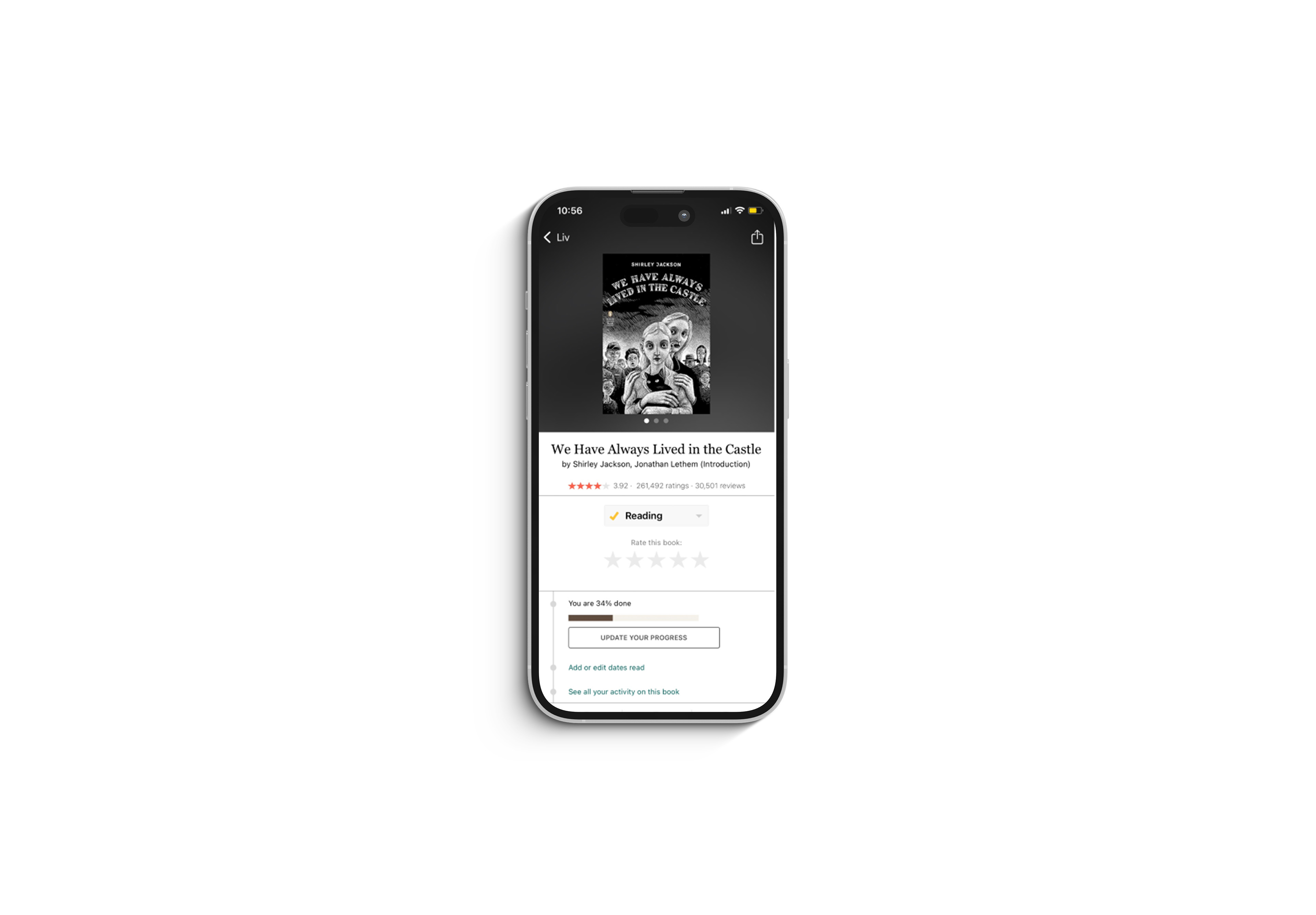
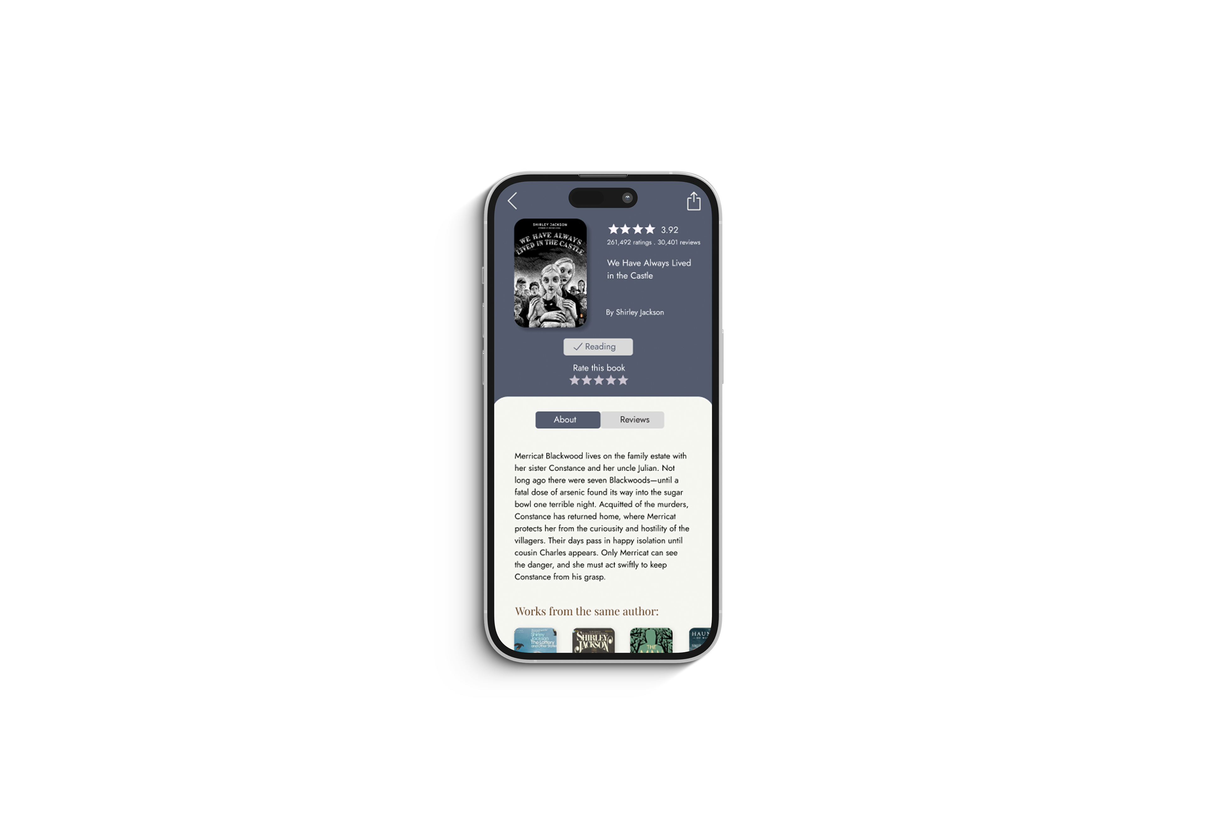
For the final page of a book profile, the goal was to simplify the layout while improving overall usability. User reviews were moved to a separate, dedicated page to reduce clutter and create a more focused experience. The book summary was brought front and center, ensuring easier access to key information for users at a glance. Additionally, the inclusion of similar book recommendations on the same page enhanced discoverability, encouraging deeper exploration and keeping users engaged within the app ecosystem.
In this project, I learned the importance of iterative design and incremental improvements in app development. Rather than completely overhauling the existing Goodreads app, I discovered the value of making subtle yet impactful changes that enhance the reading and discovery experience. By focusing on small adjustments—such as refining navigation, improving visual hierarchy, and streamlining key features like book recommendations and reading lists—I realized how these incremental changes can collectively transform the app into a more intuitive, engaging, and user-friendly platform for readers.
You can view the figma file here:
Figma | Ux\ui | Photoshop